For the longest time, I kept running away from designing logos for others. It just wasn’t my comfort zone. I always thought I couldn’t design a good one. But something changed in December 2024 when a home-based baker from Mumbai named Sana reached out to me. And this time, instead of saying no—I took the challenge.
Sana believes in healthy baking—gluten-free treats, no artificial colors, and a whole lot of love in every batch. She used to bake just for fun until one day, during the COVID lockdown, a friend living alone asked her to make her favorite honey oat cookies. Sana had shared those cookies before, and that request lit a spark.
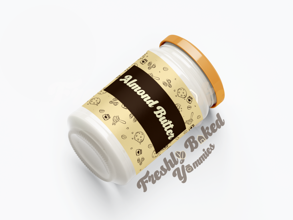
That’s where it all started. Her cookies slowly grew popular through word of mouth. Soon enough, her kitchen turned into a cozy, wholesome bakery with jars of almond butter and healthy tea-time cakes—all baked with love and purpose.
When she reached out to me, I didn’t just dive into designing her logo—I first dove into her story.
She shared something that stuck with me. She said every other designer she approached gave her the same old baking-style logos—whisks, cupcakes, rolling pins. But she didn’t want that. Sana had a vision that went beyond just baking. Her brand wasn’t about typical bakery aesthetics. It was about Freshly Baked Yummies—a name she wanted to keep as a wordmark, but with a twist. Something meaningful. Something her.
That story gave me all the clues I needed.
I first started with some rough sketches and mind-mapping.
These rough sketches help to get rid of basic clutter before you come up with an idea that fits in.
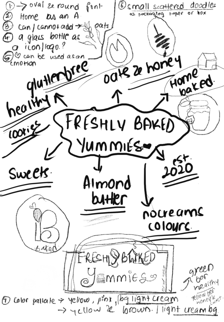
The above is a rough sketch and ideas, how I wanted to approach before I dived into designing.
Here’s how I approached it:
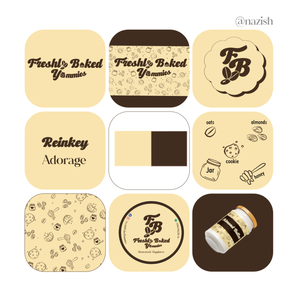
The ‘y’ in “Freshly” is shaped like an oat—the hero of her first-ever product. (Yes, I know it might look like a coffee bean, but it’s oats!).
The ‘a’ in “Baked” is shaped like a home—because her business was born in one.
And the word “Yummies”? I designed it like a jar—because whether it’s cookies or almond butter, they come packaged in jars.
Inside the jar? A little heart—to stand for baking with love.
Now, why this color palette?
Sana is allergic to artificial colors and strongly advocates against them. Her baked goods are all about natural goodness, and so I used biscuit-brown and soft beige tones to reflect the natural, healthy ingredients she uses. These earthy tones also reflect the colors of actual healthy bakes—no bright reds or food-dyed blues.
As for the fonts, I initially wanted to go with something handwritten to make it feel cozy and personal. But after experimenting and learning that fonts also carry emotion, I finalized Reinkey and Adorage—they felt just right for Sana’s brand voice.
I didn’t just stop at the logo. I created brand elements, color swatches, and a cute little mockup with her almond butter jar. When I presented everything to her, she loved it. And honestly? I was so proud of myself for taking this leap.
You might think that from here, everything was smooth sailing.
It wasn’t.
Right after this project, I fell into one of my classic overthinking phases—especially when it came to building my own brand. But you know what this project taught me?
That sometimes, you just have to trust the process. Believe in yourself. Try things even if they scare you. You might fail, sure. But you’ll also learn so much.
And sometimes, all it takes is one step, one client, and one meaningful story to remind yourself that you’re capable of doing the things you once ran away from.
I will come back with another branding case study for you.
Until then, stay healthy and keep yourself sane enough to work for your dreams.
With heart,
Your Creative Nerd,
Nazish